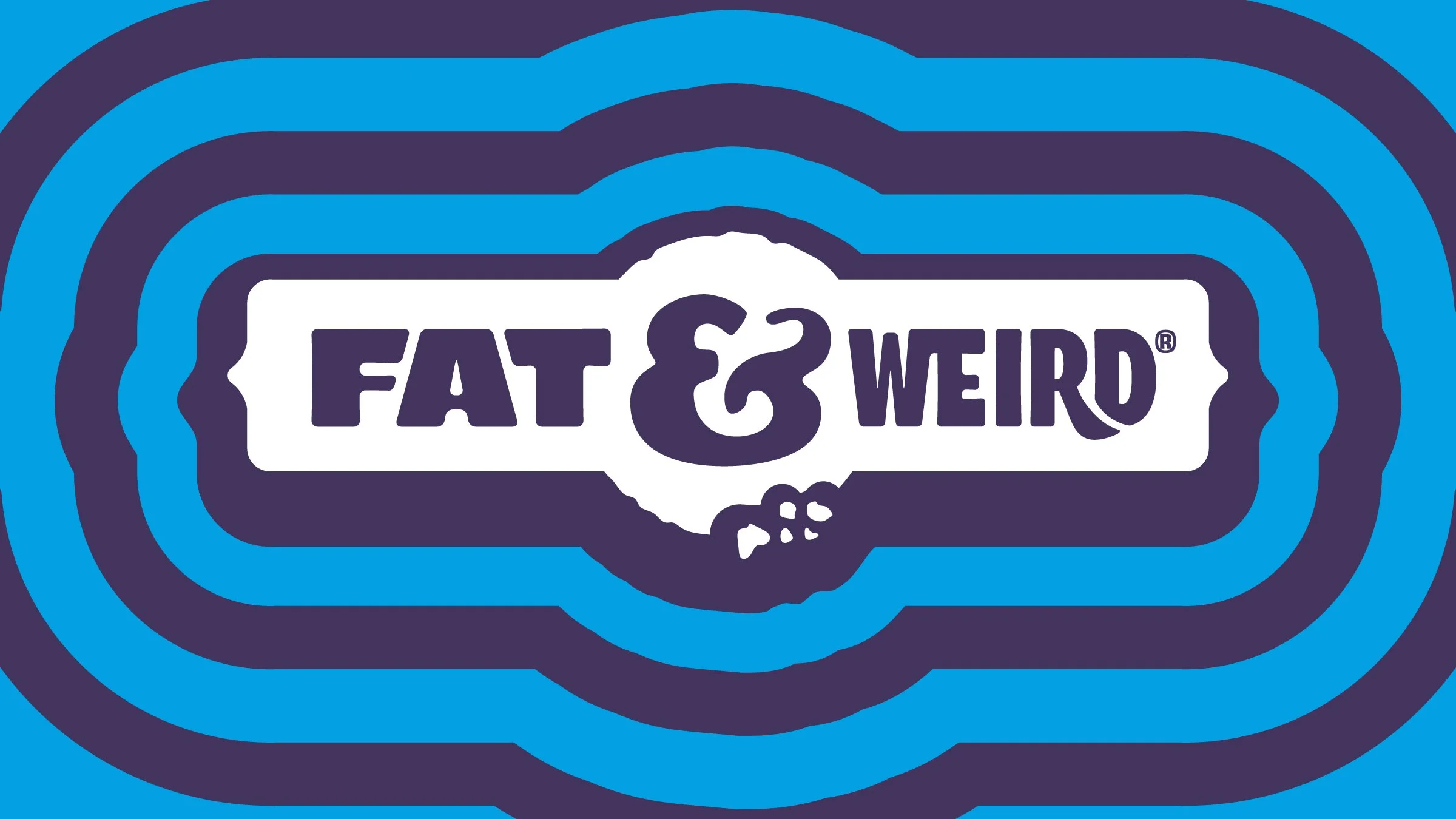
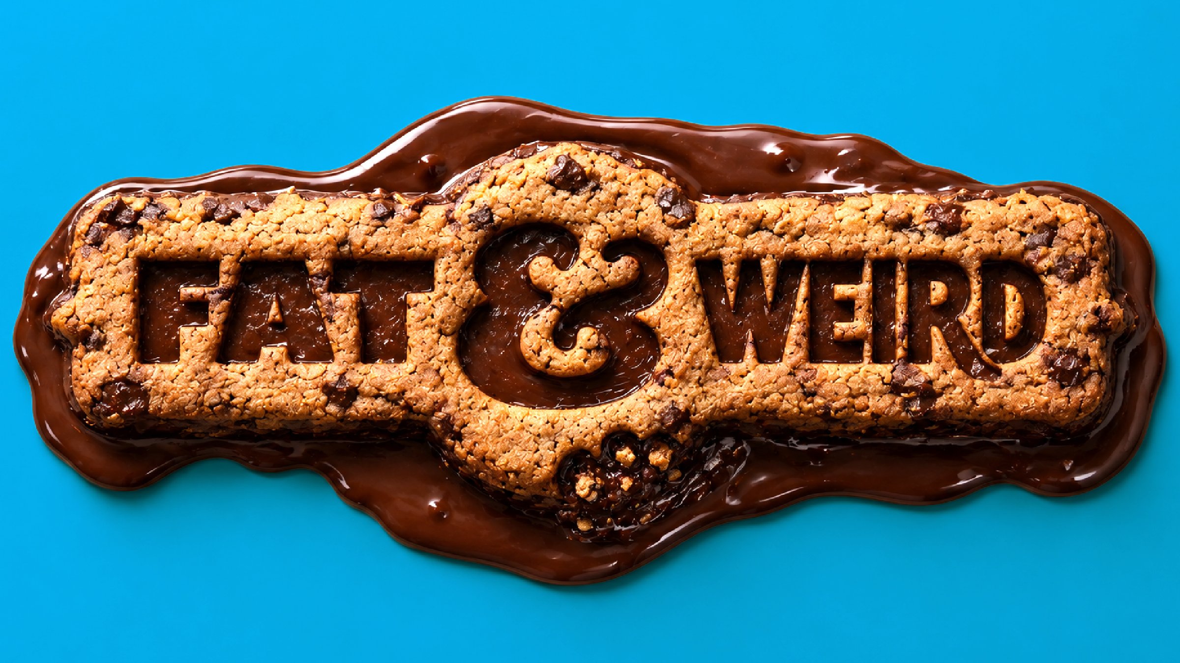
Fat & Weird Rebrand
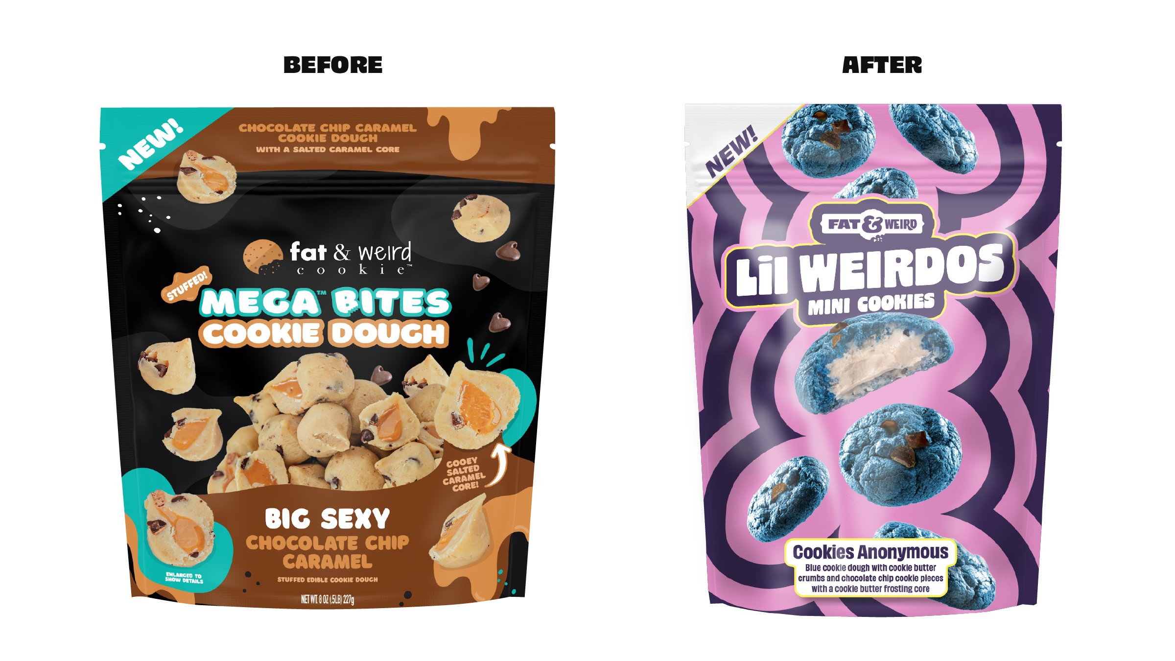
Fat & Weird built its reputation around unapologetically indulgent cookies and larger-than-life personalities, so the challenge wasn't creating more energy, it was organizing it.
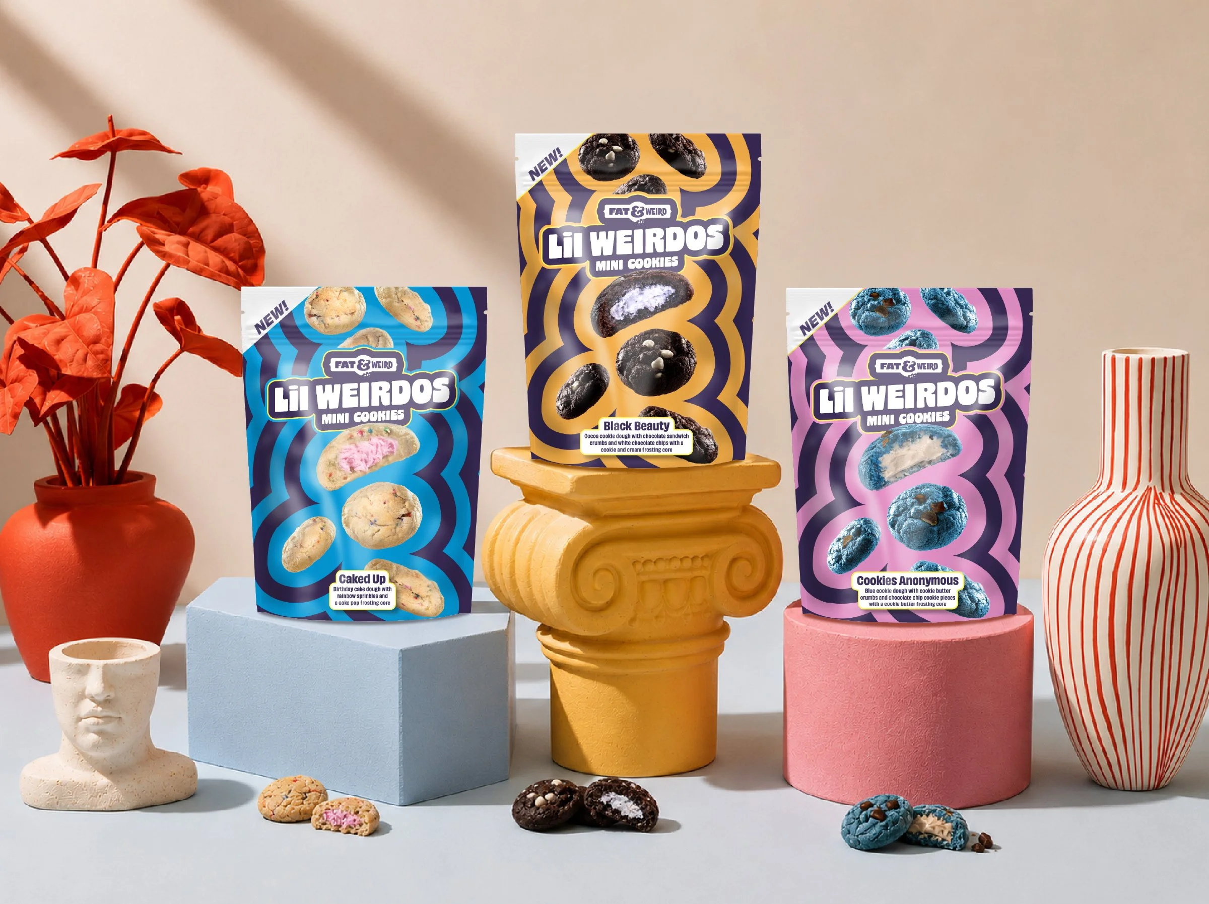
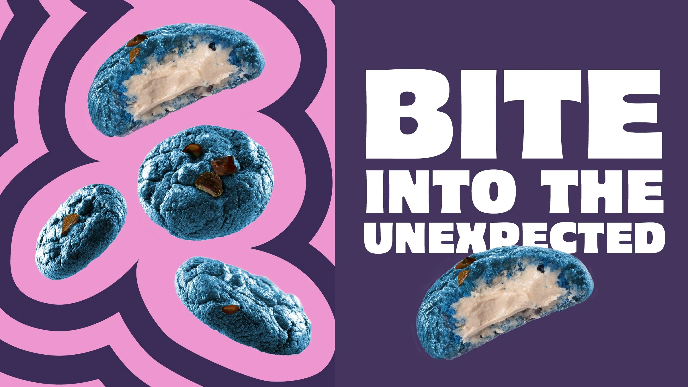
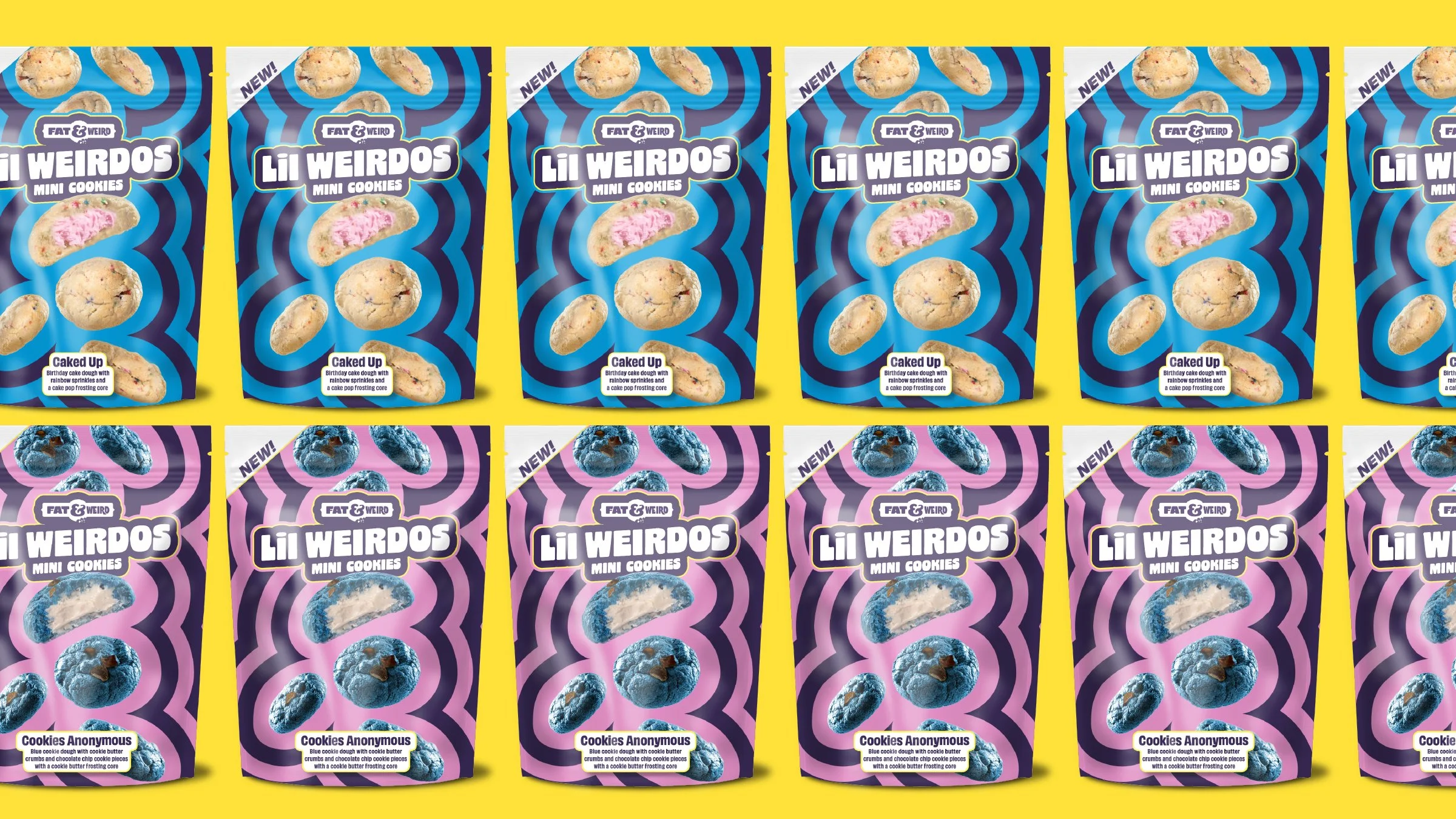
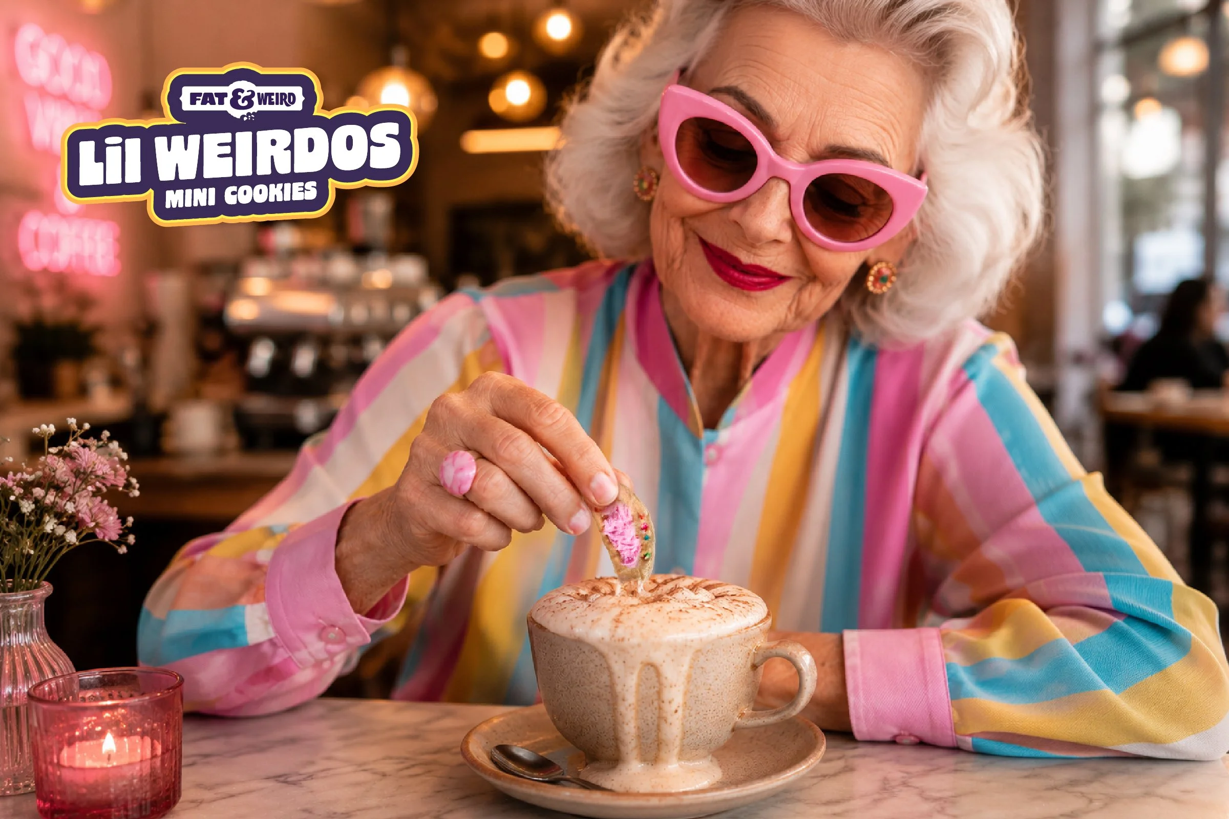
We leaned into the brand's loud personality through expressive typography, energetic color and shapes, and flavor-first storytelling that made every product feel electric. Hierarchy and graphic cues were refined to help consumers quickly identify products without sacrificing the spontaneous, over-the-top feeling that makes Fat & Weird recognizable.
The result is a system that feels bold, craveable, and unmistakably Fat & Weird, balancing indulgent personality with scalability as the brand continues expanding into new products and experiences.